To understand the intent of this blog as a web presence, we should appreciate the value of self-branding and identity construction according to Alice Marwick (2013, p356). Another useful reference is John Potter’s “storying the self” in Digital Media and Self-curatorship (2012, p31). We shall also discuss the application of basic narrative and design principles.
Narrative Theory
The first example demonstrated here is the deliberate narrative structure of the About page, which applies Aristotle’s simplified 3 Act Structure as demarcated in the subheaders, and also the use of Tzvetan Todorov’s theory as interpreted by L. Cohen – that a good narrative should have 1. Equilibrium 2. Disruption 3. Recognition/facing the problem 4. Repair 5. New equilibrium. Ceteris paribus, applying these narrative theories is likely to yield better reception to most raw information.
Signifiers Of Genre: Image & Colours
The original key visual header image was created to support the featured article on my Sheepwallker game, designed to engage the conversation of autism awareness. However, upon reflection, the colours did not adequately reflect the genre of cartoons, animation or entrepreneurship, nor were they distinctive in any way to create a strong brand. Even with a bee-sheep hybrid photoshopped in front of a live-audience in 15 minutes 🙂

After some research on many creative entrepreneur blogs, I found 2 impressive ones:
Gary Vaynerchuk & Seth Godin.
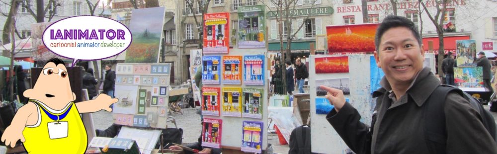
 Most of the entrepreneur blogs I liked had one thing in common: A face. Some research here shows that a face does make a difference. GaryV had a fantastic appeal with his own cover picture wielding a device with some nice high-tech looking mise-en-scene in the background. However, while the pervasive use of black was cool for tech it was not ideal for my genre – cartoons. Seth, on the other hand, had a great colour scheme had me re-evaluating what might be more befitting the art and animation genre. Fortunately, I found this picture below taken at Montmartre, that just happened to have a whiff of Gary’s pose, while emulating Seth’s cheery saturated colours.

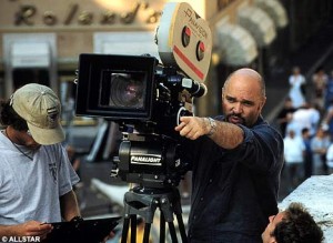
Another signifier of identity that is strongly relevant to me is that of a cinematographer, someone who composes the mise-en-scene as I did for televised shows such as Zigby. According to Dov Simmens, “Directors like photo ops of them pointing by a camera“, ie. the most common signifier of a cinematographer in action is that pointing finger, as can be seen in the link to his esteemed film school.
My work and interest as a cartoonist and animation director revolve primarily around children’s cartoons. Artists typically set up a mood board when working on a project to immerse themselves in the appropriate environment. Relevant for my genre would be a mood board of Disney characters by “3D Simon” or closer to my heart, one of Hanna Barbera characters by “A S”.
The colour scheme can also be regarded as belonging to the pop art genre. A simple search on the keywords “Pop Art” will attest to this. This Pop Art mood board by Katie Mullender is an excellent example, and is a decent match to my own chosen look and feel.
Signifiers Of Genre: Name, Font & Tagline
The name “Ianimator” is a natural combination of “Ian” and “animation”, the chosen genre. It also sounds like “Terminator”. Hence a font choice resembling the Terminator movie poster could hint at this intellectual connection.


However, this name alone does not do enough for a strong identity. Amongst all the things that define me, including art, nature, sports, research, volunteerism, photography, film etc, I selected two aspects to base this site off: my profession as a creative, as well as my mission of social entrepreneurship for special needs awareness. Hence, a tagline is a necessary extension in this case, to add context and set an expectation.

In my case, the profession alone is over-represented. For a while, I included 4 aspects of my career. However, upon further reflection, the maximum should be 3 for readability and memorability. These are important aspects of Human Computer Interaction and Usability Design. Finally, due to space constraints in the design, 2 speech bubbles were set to alternate in the banner.


For those who need to get an easily customizable WordPress theme, Twenty Eleven (as well as Twenty Ten/Thirteen/Fifteen) come highly recommended. In its original form, however, I found the font choices limited, as well as a “Site Identity” bar that took up unnecessary white space at the top. Considering the hot areas of F-Pattern research, the content got pushed way too low for my liking.
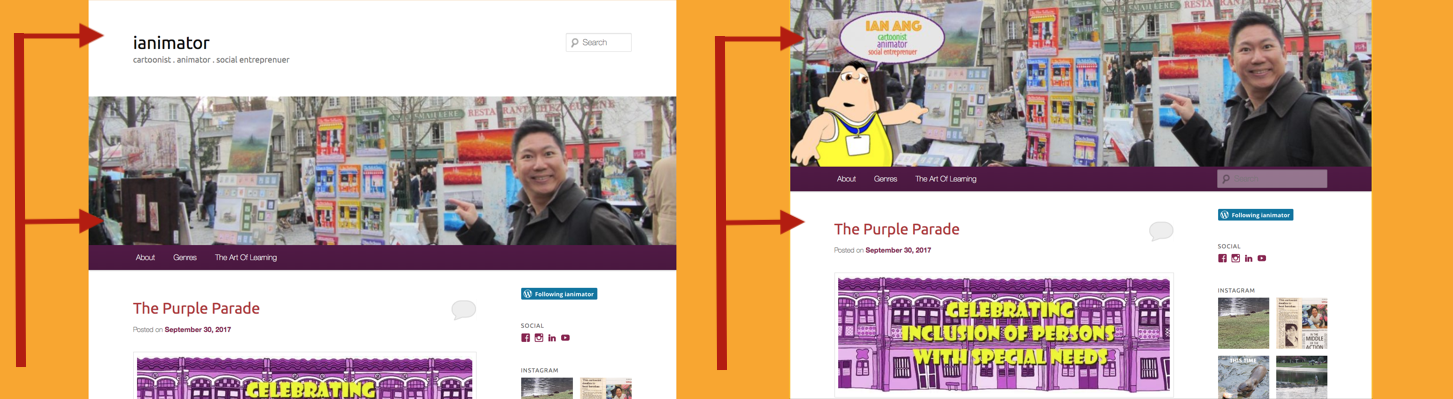
One solution, assuming you have some photoshop knowhow, is to work the Identity with your own choice of font directly into the image. This way, you can disable the default display “Site Identity” white bar, which gives a much more desirable F-pattern match with the secondary row smack on my menu bar or cover post content.
The Twenty Eleven Theme allows the customisation of colour scheme starting from the background. The chrome yellow background is inspired by Seth’s colour choices, children’s cartoons, and pop art. Media representation and visual design theory involve prioritising genre matching over personal preference (metallic grey seems to be my favourite, possibly due to being called “Ironman” by schoolmates long ago).
An added note about layout, much as I like Seth’s strong design (and gracious permission to use his blog picture in my analysis), I took longer than necessary to find the link to his bio. After noting the key highlights of the layout, the next instinct is to scroll down looking for more stuff. Nothing found.

It turns out I had to scroll right (or zoom out). This is a possible drawback of deviating from the common F-pattern layout. A minor risk, some may say, but a risk, nonetheless.

Blog Posts
From Erving Goffman’s book Presentation of Self in Everyday Life (1956), our perceived identity is the culmination of all our presentations to others. This is even more true of our online identity today. The content mix chosen for this blog reflects the tagline presented in the header:

Social Entrepreneur: The post 50 First Dates With WE signifies an exemplar of work with a partner social enterprise for the employment of those with special needs. The post The Purple Parade is a perfect example of a mass media collaboration to raise awareness of persons with special needs, and my part as a volunteer for the cause.
Cartoonist/Animator – Hooks/Plot Devices
One last feature that I, like so many others, have found totally irresistible every single time I visit Seth’s blog. This:

What a great idea to initiate “engagement”! I liken this to a plot device used in good narratives. It works as a clever mechanism to help move to story forward, arguably even more critical for an interactive blog as a story literally ends when engagement stops.
With a less adorable/clickable head, my own version of a plot device borrows from Pikotaro‘s meme to re-state my mission of spreading engagement with special needs communities.

A plot device in this context could be a meme, hashtag, cute cat, or any instrument that increases the likelihood of further engagement. Applying Stuart Hall’s theory of audience reception oftentimes pits the preferred reading against the oppositional reading deliberately to create controversy, a risky but well known strategy in increasing engagement. In this case, the “cute” or “funny” reaction would be the preferred reading, while “cheesy”, “cringeworthy” or “not again” would be oppositional readings.
Developer: The post Sheepwalker: A True Story is based upon an autistic girl’s encounter with sheep in New Zealand. This inspired me to create a simple casual game that can be accessed online at http://autonomicarts.com/sheepwalker/ This, of course, also serves to showcase the facet of being a computer science graduate turned game developer, incorporating both arts and technology which are integral to my identity.
Cartoonist: This bottommost post Giving Time True Value is just a casual throwback to my first job as a cartoonist for the local paper, The Sunday Times, featuring a comic published during that period.
In summary, these posts serve as a cross sectional representation of the professional elements I have chosen to my identity in this online presence, which is meant to be consistent with the title, tagline, genre and visual design.
